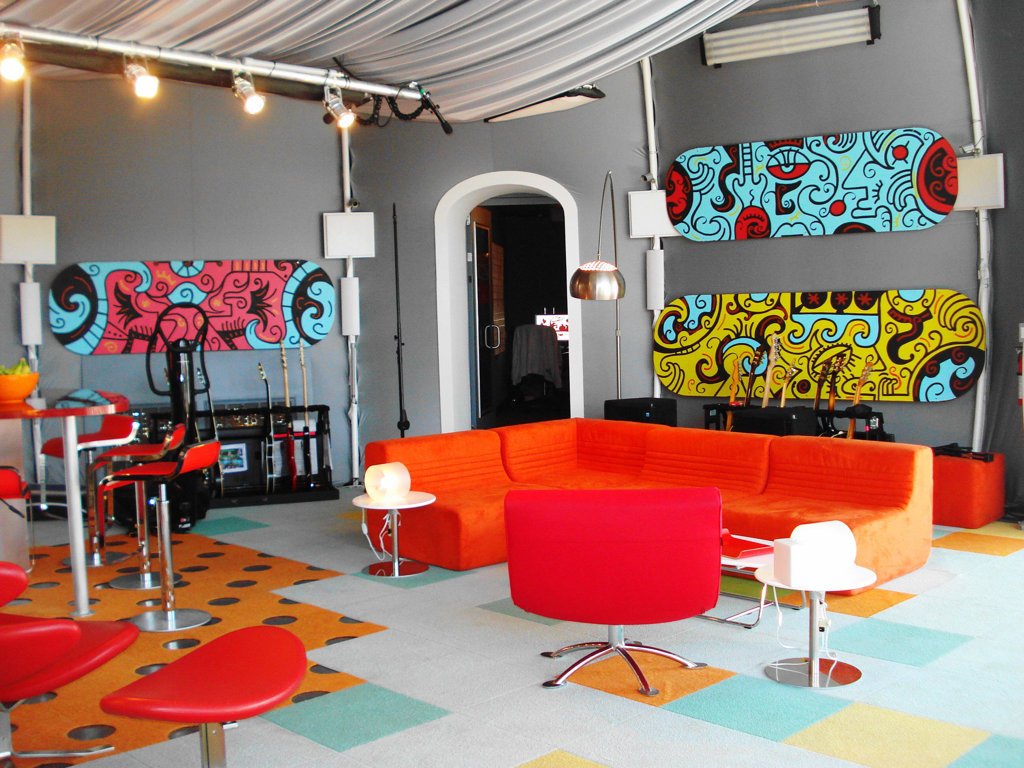
Pop art is an art form that dates back to the '50s. The word pop is short for popular - literally translated means the technical term for the people, the art for the masses. This form of modern art has evolved in the United States and the United Kingdom.
Inspired by advertising campaigns, billboards and television artists such as Andy Warhol, Roy Lichtenstein and Richard Hamilton turned to mediocrity. As part of the so-called anti-art - the campaign, they released the banal images of famous actors and transformed into exciting new art form.
Pop art interior design style is very emotional and energetic, so it is particularly close to young people who are ready to live in perpetual motion.

Bright colorful interior exhibitions are made of plastic, synthetic fibers, functional objects of catchy form, repetitive accessories, posters, and inexpensive popular souvenirs such as the plush heart.
1.Identical items of different sizes are placed at different levels.
2.large print or photo on the glass with a recognizable image can be placed in the center of the space: portraits of religious figures or products (a portrait of Che Guevara or advertising of Coca-Cola in the bedroom above the headboard perfectly match the style preferences).
3.Carpets with the logo of a well-known company or expressly synthetic animal skins, wall tiles with the repeating and recognizable patterns.
4.Furniture – bright colors, with a catchy pattern, perhaps – with glossy surfaces or plastic.
The walls, ceiling, and floor do not carry background notional load visually, they may merge into one decoration conceived by the artist. The pop art style in the interior allows acid colors that blend with the white, contrasting items together at the same time. A sense of proportion is determined only by your ability for a long staying in such screaming scenery.
1.Optimum division of the walls by color is when one wall remains cream or beige, and it accommodates the mirror of unusual shape or stylized print, the other two are painted in bright tones, but in tune with each other, the fourth – the one that includes a door or window – in simple ornamental technology.
2.The ceiling can be multileveled and asymmetrical with colorful lighting as well as to have a glossy plane surface.
3.The floor is the most neutral part of the composition. But you can possibly meet a bright carpet (or restrained color with a chaotic pattern) here.
4.The furniture amount is minimal. However, it has futuristic, unusual shape, squat, and deserving special reviewing.
5.Accessories are plastic, chrome, but always of amusing form. For example, in the form of a female silhouette or comic book heroes.


